Hi everyone!
Hi everyone, CTM Mary-Lynne here and I thought I would create a PSE(12) tutorial for using Jill's Blendits 1 Layered Template. I'm cheating and using a lot of the text and format from Jill's Photoshop tutorial. Just a general warning up front, this template is VERY addictive!
I'm using Photoshop Elements Version 12 and Windows 7 for this tutorial.
We'll be using Jill's Blendits Layered Template 1 and her Beach Trip Collection for this tutorial.
(you can choose any kit you'd like to compliment the photo or photos you are using!)

This Blendits Template
and Beach Trip Collection are available in Jill's Pickleberry Pop store so grab a copy and follow along!
and Beach Trip Collection are available in Jill's Pickleberry Pop store so grab a copy and follow along!
Let's go!
When you open up your template and you'll see this first:

It's just the top layer with some handy points.

You can delete it or click on the "eye" to hide it.
You can delete it or click on the "eye" to hide it.
Beneath is your template:

Now you have 2 choices here....you can hide all the layers and work up from the bottom one by one
(that's what I do so I can see what I'm clipping to easily)
or leave them all visible.
For this particular tutorial I'll be going layer by layer from the bottom up...unhiding as I go!
Step 1:
You can hide all the layers by ALT/Click on the "eye" of the bottom layer. That will hide all but the bottom layer.

Drag the first paper onto your template. I actually decided to leave this one white, but you should feel free to use whatever paper you like.
Step 2:
Unhide your next layer by selecting it and clicking on the layer's "eye". (see highlight on the eye)

Step 3 (clipping):
Drag your next paper onto your template
(I chose cbj_beachtrip-artsypapers-02)
CTRL + G to clip the paper to the layer below. Keep the paper available, I'm going to use it a few more times!
By the way, I'm recreating a finished page, so you may see the finish page along with the in progress page in the photo bin.

By the way, I'm recreating a finished page, so you may see the finish page along with the in progress page in the photo bin.
Unhide the next layer above the paper and repeat Step 3 with your choice of paper.
(I used cbj_beachtrip-artsypaper-02 again!)

Continue to unhide the layers one by one (make sure they're activated before dragging your papers on) and clipping your papers to them. Feel free to rotate, erase sections, move the mask and change the opacity as you like!
You can also create a new layer above one of the Blendits layers and fill with a complimentary color as well...the choice is yours!
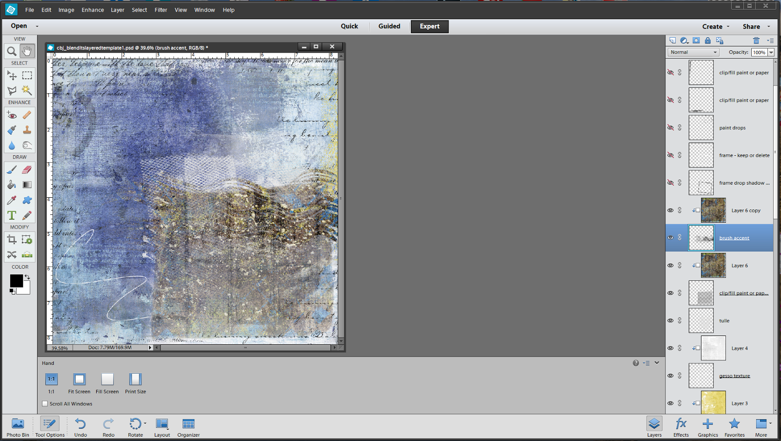
So now I've chosen papers and clipped them to my template layers. I am done up through the Gesso texture layer. One thing I did that that's a little different, is I attached two papers to one of the layers and and erased part of the top one. Neither color was quite right so I combined them. (this is why I warned you that these templates are additive!!!)

You can also see, in the image above, that there are a couple of layers that I chose to use without clipping a paper or color (the doodle and the printed words) and a layer that I chose not to use at all. It's all up to your personal taste!
On one of the other layers, the one that looks like a rectangle in the upper left section, I wanted to use the dark blue paper, but it was a little dark for my taste so I lowered the opacity of the mask layer (not the paper), till it was perfect! See highlights below.

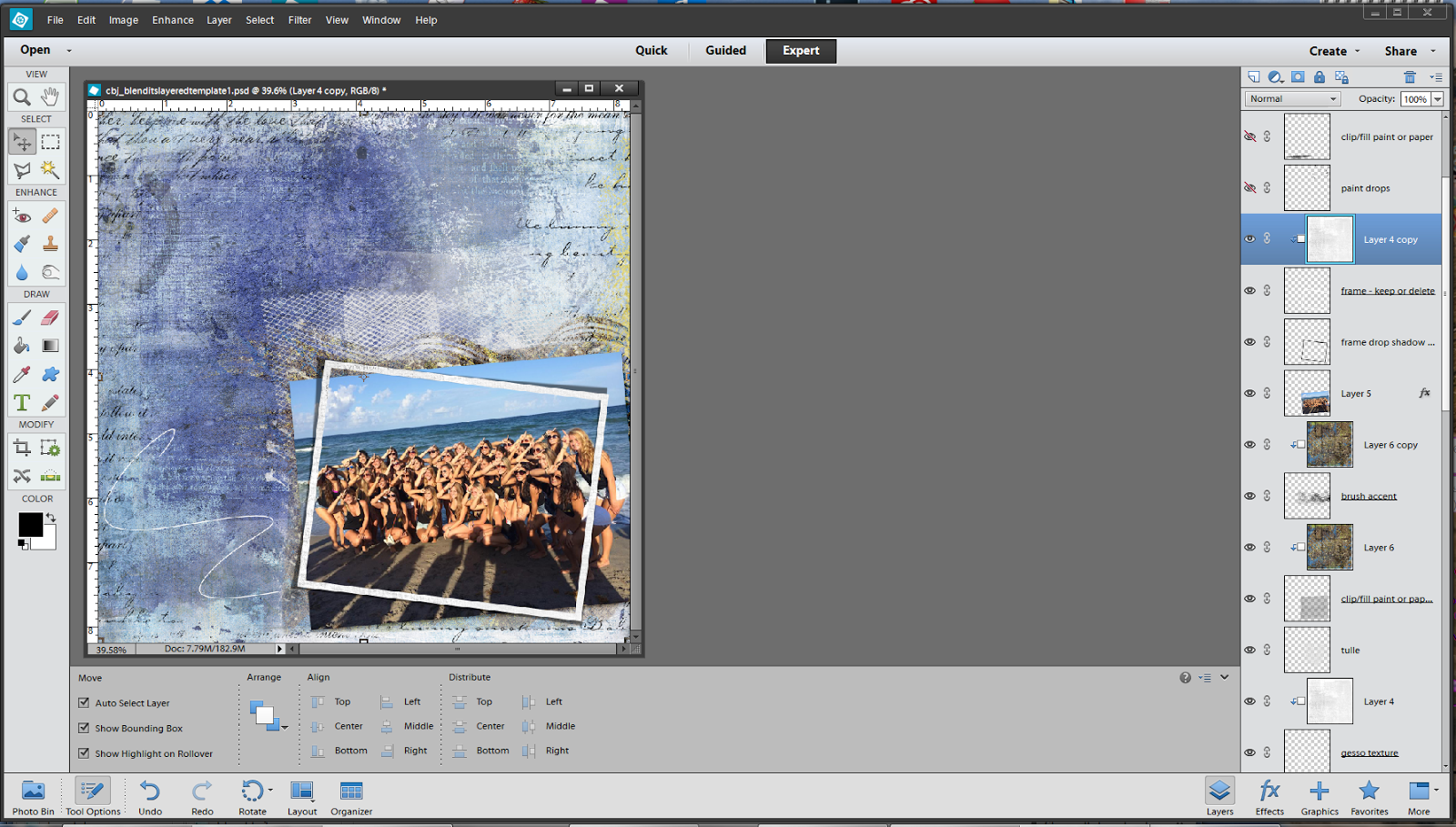
Ok we have our base papers, time to hit the photo! This is where things get really interesting. I had decided up front that I did not want my photo attached to a mask as I wanted the photo to be full opacity. So, I clipped a paper (cbj_beachtrip-paper-09 to the photo mask. Still not quite what I was looking for so I wandered thru Jill's elements and grabbed the cbj_beachtrip-brushaccent and the cbj_beachtrip-tulle. I placed the tulle under the photo mask and clipped paper and then placed the brush accent above both of those and clipped the same paper...COOL!!!
Now it's time for the photo! I popped in the pic, rotated to suit me and turned on the frame shadow and frame layers. I liked the frame as is, but I wanted it a little softer, so I used the same white paper I clipped to the gesso layer. And here is my darling Grand-daughter with her sorority, celebrating bid day at the beach.
Finally, we have the layers above the photo. I used yellow paper for the top ones and brown for the bottom to look like the sun and sand. As always, it's your choice! I also chose to not use the top doodle.

We are done with the template! How cool is this? Add your elements and drop shadows and you've got a fabulous artsy layout. I grabbed some awesome elements from the Beach Trip collection to complete my layout and here it is!

The only rule you need to remember, is that there are no rules!!! Do whatever suits you and have fun!
*****************************
Here are a few handy tips to use for templates that have a script or text layer....these can also be applied to any layer in the template as well!
The only rule you need to remember, is that there are no rules!!! Do whatever suits you and have fun!
*****************************
Here are a few handy tips to use for templates that have a script or text layer....these can also be applied to any layer in the template as well!
-Clip a solid paper to the layer
-Create a new layer above and fill with a complimentary color then clip
-Leave as is
-Change the Layers Blend Mode to Divide, Soft Light, or Overlay
(these are the main ones I use but feel free to experiment with the others!)
-Reduce the Opacity
*****************************


